The Naya Energy Dashboard
The Naya Energy Dashboard provides an easy-to-understand overview of your live data, allowing you to monitor current energy usage, energy cost, and equipment performance. The real-time monitoring allows building managers and operators to keep track of equipment and identify critical failures or breakages ahead of time, with the Nayalerts.
Navigate through the dashboard guide by clicking on a section you want to explore.
Hover over the blue buttons ![]() on the Naya Energy Dashboard to explore its easy-to-use interface.
on the Naya Energy Dashboard to explore its easy-to-use interface.
CURRENT SITE DEMAND
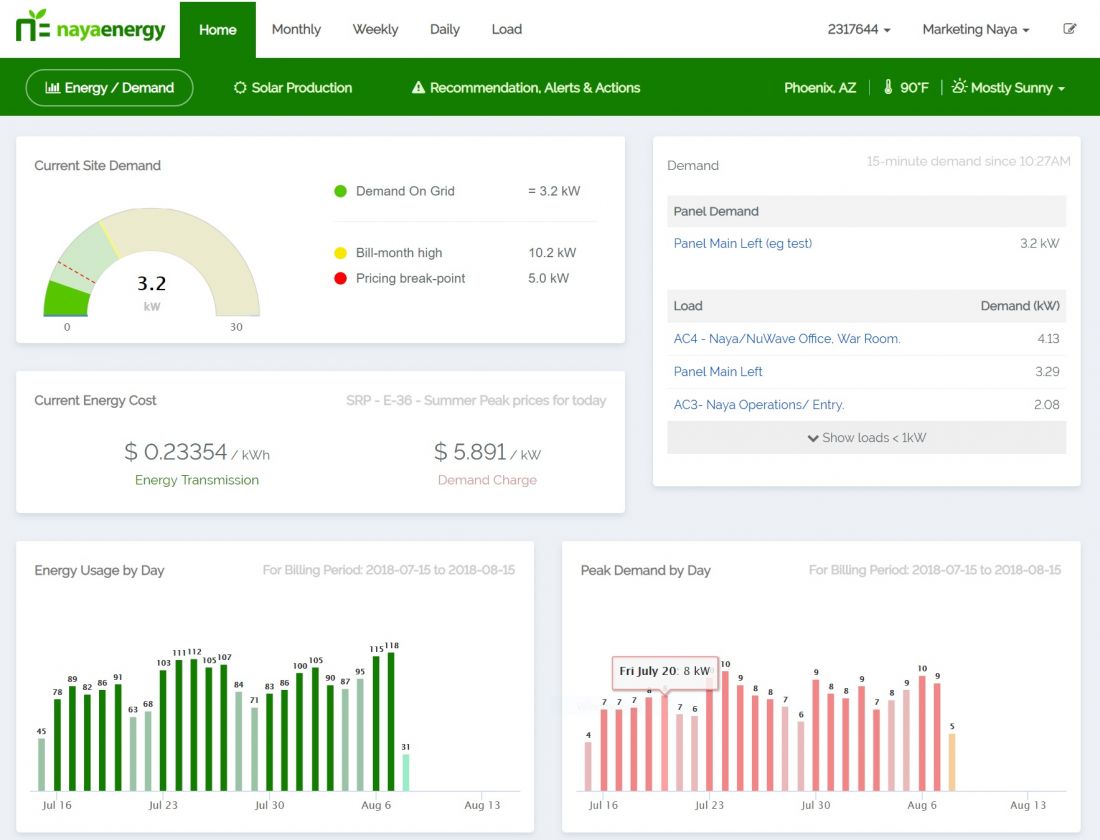
The Naya ESP™ dashboard turns your energy data and rate plan into a readily accessible overview that's updated every minute.
By using sensory technology, Naya ESP™ collects energy data from your equipment and overlays information like your rate plan, demand charges, and if applicable, your solar production.
LIVE ENERGY UPDATES
The information displayed will depend on your rate plan, size of your site and number of loads (your equipment) connected.
The current site demand panel displays time intervals based on your demand charge.
For example: If your rate plan measures demand charge in 15 minute intervals, the Naya ESP™ dashboard will update every minute, displaying 15 minutes at a time.
DEMAND PANEL
What is causing my demand charges to increase?
Depending on your rate plan, this panel ranks equipment based on which is pulling the most energy during a 15 or 60 minute interval.
This allows you to take control of your equipment's health. To understand why your equipment is pulling more energy, select the "Load" and it will direct you to an overview of that particular euipment.
Load = equipment attached to the Naya Energy IoT sensor.
WEATHER WIDGET
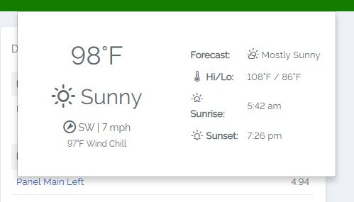
Click on the climate button for up-to-date weather information at your site's location.
CURRENT ENERGY COSTS
The information displayed on this panel will depend on your rate plan, time of day and demand usage.
ENERGY USAGE
An interactive breakdown of your site's energy usage and demand charges throughout your current electric bill cycle. Hover over the bars to see information about a specific day.
RECOMMENDATIONS, ALERTS & ACTIONS
By using your real-time energy data and rate plan information, Naya technology will generate custom alerts based on status of your equipment, along with recommendations that can be assigned to a team member to take preventative action.
Scroll down to see the dashboard.
Working With Your Solar
If you have solar, Naya’s platform makes it easy for you to see how your solar is producing without having to go to your solar monitoring system.
-
CURRENT SITE DEMAND
The Naya ESP™ dashboard turns your energy data and rate plan into a readily accessible overview that's updated every minute.
By using sensory technology, Naya ESP™ collects energy data from your equipment and overlays information like your rate plan, demand charges, and if applicable, your solar production.
-
LIVE ENERGY UPDATES
The information displayed will depend on your rate plan, size of your site and number of loads (your equipment) connected.
The current site demand panel displays time intervals based on your demand charge.
For example: If your rate plan measures demand charge in 15 minute intervals, the Naya ESP™ dashboard will update every minute, displaying 15 minutes at a time.
-
DEMAND PANEL
What is causing my demand charges to increase?
Depending on your rate plan, this panel ranks equipment based on which is pulling the most energy during a 15 or 60 minute interval.
This allows you to take control of your equipment's health. To understand why your equipment is pulling more energy, select the "Load" and it will direct you to an overview of that particular euipment.
Load = equipment attached to the Naya Energy IoT sensor.
-
![]()
WEATHER WIDGET
Click on the climate button for up-to-date weather information at your site's location.
-
CURRENT ENERGY COSTS
The information displayed on this panel will depend on your rate plan, time of day and demand usage.
-
ENERGY USAGE
An interactive breakdown of your site's energy usage and demand charges throughout your current electric bill cycle. Hover over the bars to see information about a specific day.
-
RECOMMENDATIONS, ALERTS & ACTIONS
By using your real-time energy data and rate plan information, Naya technology will generate custom alerts based on status of your equipment, along with recommendations that can be assigned to a team member to take preventative action.
Scroll down to see the dashboard.
-
Working With Your Solar
If you have solar, Naya’s platform makes it easy for you to see how your solar is producing without having to go to your solar monitoring system.
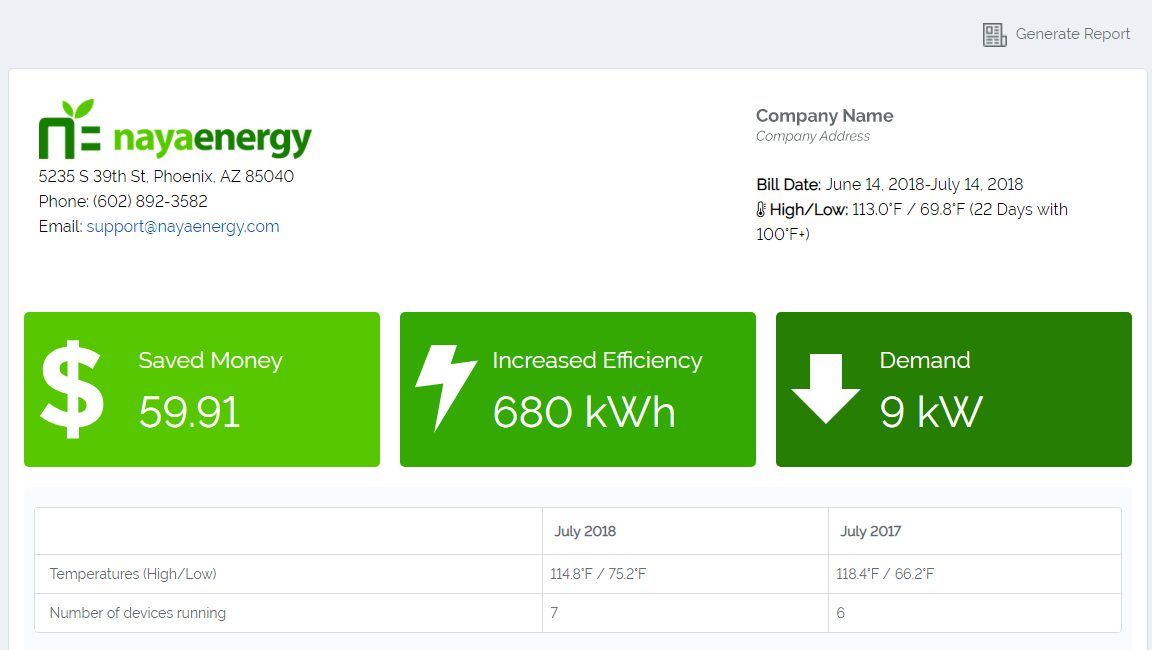
Monthly Savings Report
ALERTS
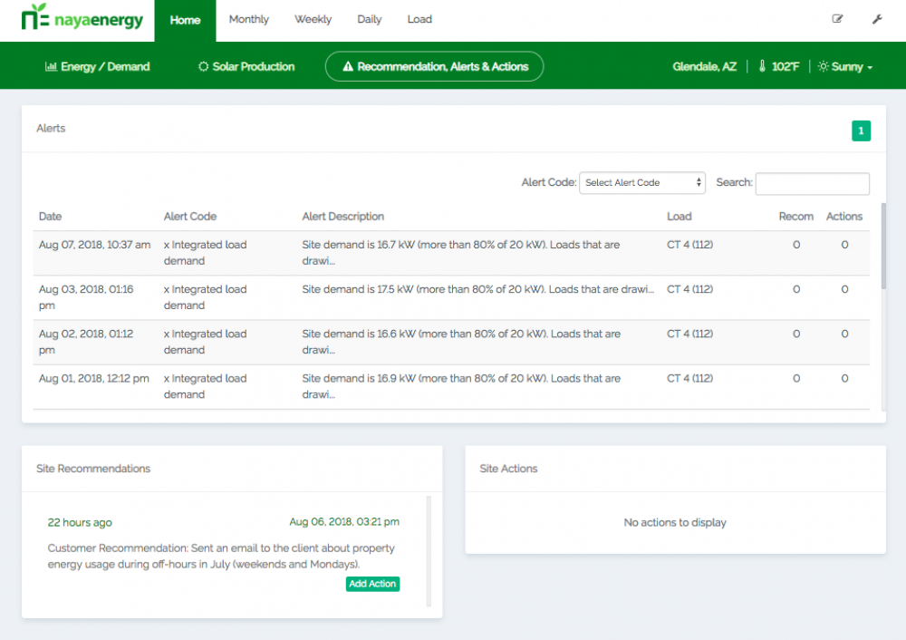
ALERT CODE: Indicates the type of problem occurring with a particular load.
ALERT DESCRIPTION: Provides a brief explanation as to why your load has triggered an alert.
Load: Equipment attached to the Naya Energy IoT sensor.
SITE RECOMMENDATIONS
When an alert is detected, a Naya Energy analyst will send you custom recommendations on how to fix or improve an under-performing load.
SITE ACTIONS
All alerts and recommendations can be assigned to someone on your team. This panel is an overview of all of the Site Actions that have been assigned.
-
ALERTS
ALERT CODE: Indicates the type of problem occurring with a particular load.
ALERT DESCRIPTION: Provides a brief explanation as to why your load has triggered an alert.
Load: Equipment attached to the Naya Energy IoT sensor.
-
SITE RECOMMENDATIONS
When an alert is detected, a Naya Energy analyst will send you custom recommendations on how to fix or improve an under-performing load.
-
SITE ACTIONS
All alerts and recommendations can be assigned to someone on your team. This panel is an overview of all of the Site Actions that have been assigned.
When an Alert is sent to the dashboard, it can be assigned to someone on your team with an action, instructions and due date. Streamlining the internal operations by providing seamless communication between the equipment and business owners.
Your Naya Energy dashboard works to streamline your internal operations. By assigning tasks to your alerts, your team can be proactive.


Get alerted to your cell phone

Monitor Your Solar Production
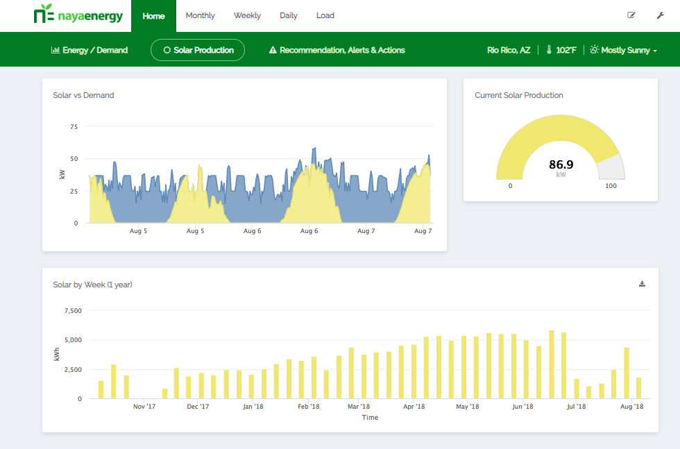
The multi-layered chart shows you how much energy your solar panels are producing on a day-to-day basis.
For example: The yellow layer displays the solar production. On August 6, you can see that the blue layer (the electrical usage) is higher than the solar production. This shows that there was overcast blocking the solar production, which then caused the electrical pull to increase.
How Much Solar Energy Are you Capturing?
The Solar By Week panel is a simple breakdown of your day-to-day solar production.
By comparing this bar chart to the Solar Vs Demand graph, you can see how on August 6, solar production dipped. This was probably due to overcast.
-
Monitor Your Solar Production
The multi-layered chart shows you how much energy your solar panels are producing on a day-to-day basis.
For example: The yellow layer displays the solar production. On August 6, you can see that the blue layer (the electrical usage) is higher than the solar production. This shows that there was overcast blocking the solar production, which then caused the electrical pull to increase.
-
How Much Solar Energy Are you Capturing?
The Solar By Week panel is a simple breakdown of your day-to-day solar production.
By comparing this bar chart to the Solar Vs Demand graph, you can see how on August 6, solar production dipped. This was probably due to overcast.
EQUIPMENT LEVEL MONITORING
CLICK ON A TIMELINE TO VIEW THE NAYA ENERGY DASHBOARD
MONTHLY
DASHBOARD OVERVIEW
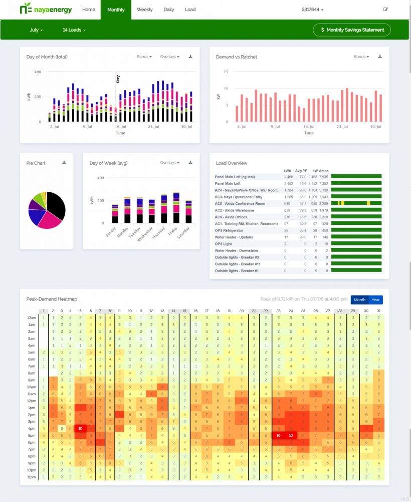
This monthly breakdown of your energy usage allows you and your team to monitor your energy usage, and take control of internal operations.
SITE LOAD OVERVIEW


PEAK HEAT MAP
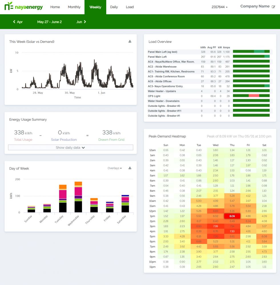
This panel uses heat index as a color coded system to show days that had an increase in energy usage and demand charges.
This overview is like a visual report of your energy use. The red/ orange quadrants, clustered together shows a pattern that is easy to recognize and act upon.
OVERLAYS
Get more insight into your energy consumption by overlaying different types of data.

Overlay as much data is needed. Hover over the graph to get snapshot information.

EQUIPMENT OVERVIEW
Your monthly, weekly and daily dashboards have a load overview that makes it easy to identify what piece of equipment (or load) is performing below standards.
Get a closer look at the loads performance by clicking on it and assessing it's "profile".

-
SITE LOAD OVERVIEW

-

-
PEAK HEAT MAP
This panel uses heat index as a color coded system to show days that had an increase in energy usage and demand charges.
This overview is like a visual report of your energy use. The red/ orange quadrants, clustered together shows a pattern that is easy to recognize and act upon.
-
OVERLAYS
Get more insight into your energy consumption by overlaying different types of data.

Overlay as much data is needed. Hover over the graph to get snapshot information.

-
EQUIPMENT OVERVIEW
Your monthly, weekly and daily dashboards have a load overview that makes it easy to identify what piece of equipment (or load) is performing below standards.
Get a closer look at the loads performance by clicking on it and assessing it's "profile".

The heat map helps you to visually understand what days over your billing month are pulling more energy than others.

To get further information by clicking on a day on the map. It will take you to the daily overview of the day selected, with an hour-to-hour breakdown of your loads energy usage.

WEEKLY
DASHBOARD OVERVIEW
Narrow your data down to a weekly overview, and get a better idea of how your equipment is working on a day-to-day timeline.
DAILY
DASHBOARD OVERVIEW
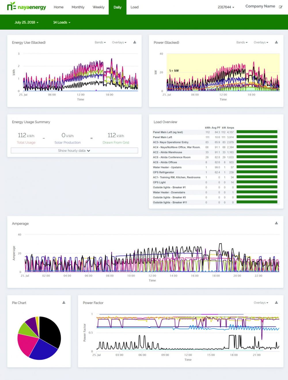
If you, or a service technician, have an understanding on how electricity is used on a piece of equipment, this data can help identify the core issues.
ENERGY USAGE BREAKDOWN

BREAKDOWN OF ENERGY USAGE
These panels display graphs and charts that can help you to visually identify critical behavior. For more information on the graph hover your cursor over the graph to get a better understanding of your daily energy usage.
HOUR BY HOUR BREAKDOWN
By hovering over a point on the chart to understand further data

-
ENERGY USAGE BREAKDOWN

-
BREAKDOWN OF ENERGY USAGE
These panels display graphs and charts that can help you to visually identify critical behavior. For more information on the graph hover your cursor over the graph to get a better understanding of your daily energy usage.
-
HOUR BY HOUR BREAKDOWN
By hovering over a point on the chart to understand further data

DO YOU HAVE A MAINTENANCE AGREEMENT?
If your data providers don't provide you with maintenance agreements, Naya can find you a provider that will work with you.
LOAD DASHBOARD
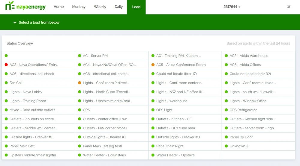
View the health status of your equipment all in one place. It's an interactive inventory list for your connected site.
EQUIPMENT HEALTH STATUS
If you're experiencing an increase in energy usage, the Naya ESP™ dashboard will take the data, identify the under-performing load (equipment) and update the Load Dashboard with a color coded system.
UNDERSTAND YOUR EQUIPMENT ON A DIFFERENT LEVEL
The dashboard will alert you that a piece of equipment is under performing by changing the color of the indicator.
The orange light means the dashboard has detected an issue with your equipment, and is probably at risk of breaking.
The red light indicates that a piece of equipment has failed.
-
EQUIPMENT HEALTH STATUS
If you're experiencing an increase in energy usage, the Naya ESP™ dashboard will take the data, identify the under-performing load (equipment) and update the Load Dashboard with a color coded system.
-
UNDERSTAND YOUR EQUIPMENT ON A DIFFERENT LEVEL
The dashboard will alert you that a piece of equipment is under performing by changing the color of the indicator.
The orange light means the dashboard has detected an issue with your equipment, and is probably at risk of breaking.
The red light indicates that a piece of equipment has failed.
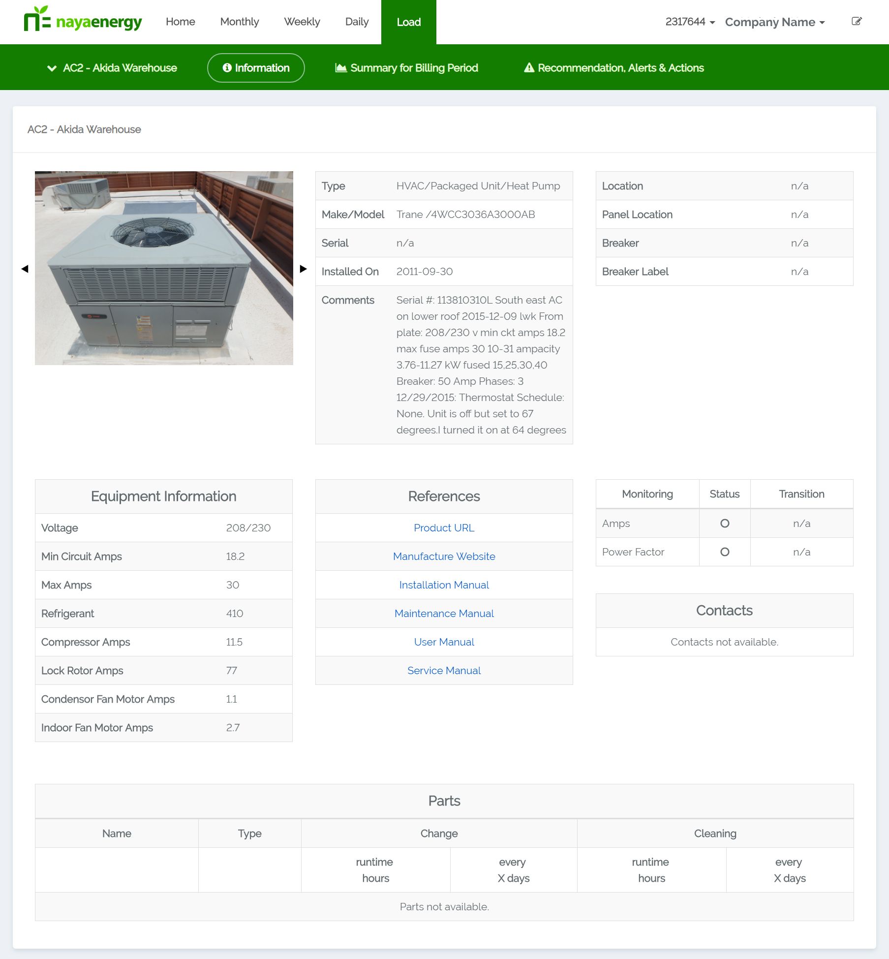
Each load will have a "profile" of information. Click on the load you want to explore.
INFORMATION ALL IN ONE PLACE
Each piece of equipment connected to the IoT sensors has a profile where all the information like historical data and user manuals is stored.
SUMMARY FOR BILLING PERIOD
Get a deeper look at your equipment's performance and health over a billing period.

Compare the equipment's health from previous month.

-
INFORMATION ALL IN ONE PLACE
Each piece of equipment connected to the IoT sensors has a profile where all the information like historical data and user manuals is stored.
-
SUMMARY FOR BILLING PERIOD
Get a deeper look at your equipment's performance and health over a billing period.

Compare the equipment's health from previous month.

